How to Style a Console Table That Makes a Statement
My hallway looked empty and uninviting for years. I tried a single sculptural lamp and a tiny bowl. It read unfinished. After reworking scale and layering, the console now reads like a designed moment. I spent about $320 on anchors and accents and still had room for practical storage under the table.
Quick context: This guide is for modern–organic console styling. Budget: $150–$400 depending on anchors. Works for entryways, behind sofas, or under a TV. The approach follows current trends: layering for depth, mixed organic materials, and asymmetric balance.
What You'll Need for This Look
Foundation pieces:
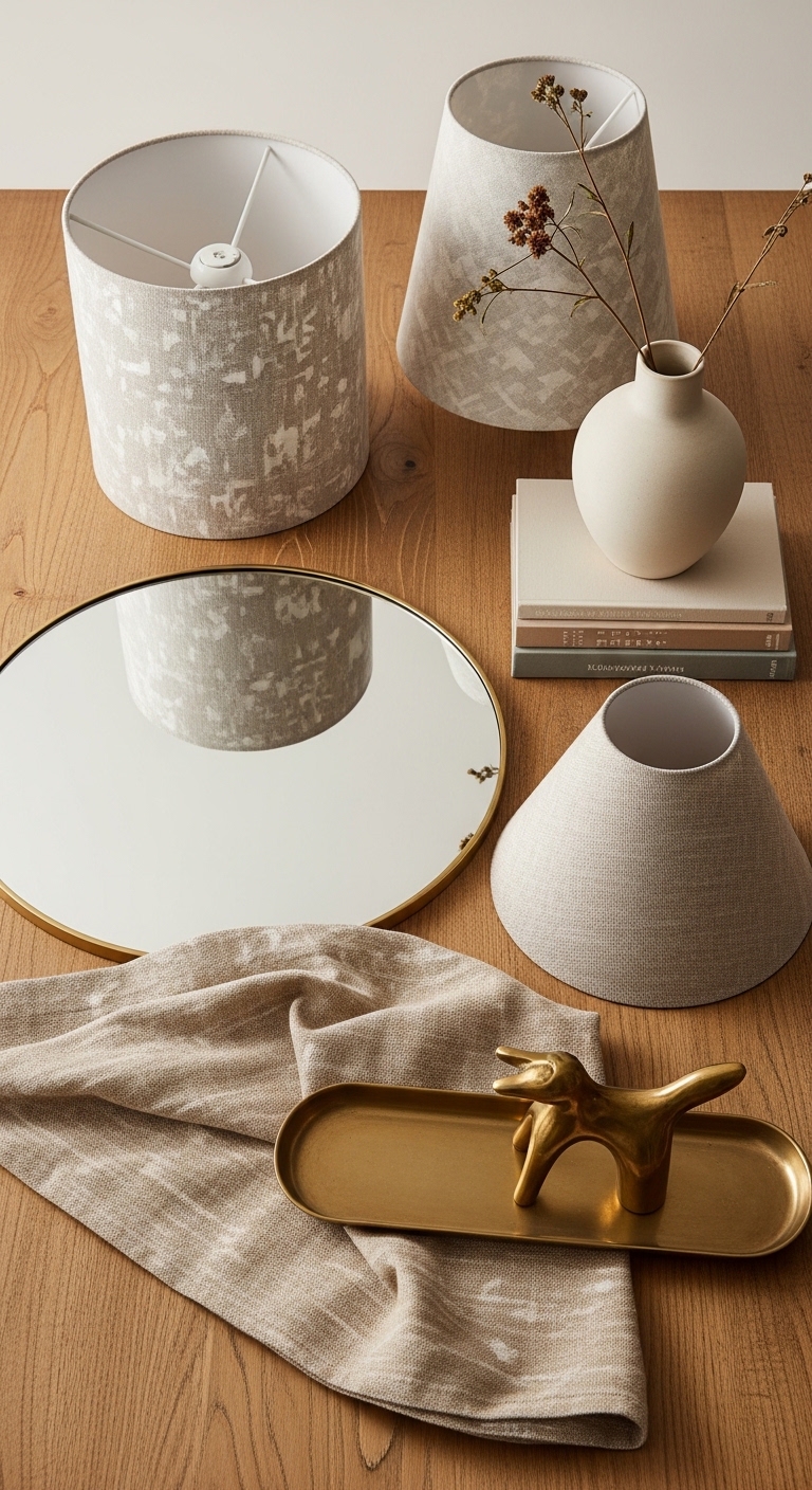
- 48-inch white oak console table (~$180-350)
- Round brass-framed mirror, 30-inch (~$60-120)
Lighting & anchors:
- Pair of table lamps with linen shade (set of 2) (~$80-160 for pair)
Corraling & vignettes:
- Wood and glass tray 16×10 (~$30-50)
- Set of coffee table books, large format (pack) (~$20-40)
- Scented glass candle, 12 oz (~$20-35)
- Small brass animal figurine (turtle or hare) (~$25-45)
Height & texture:
- Tall white ceramic vase, 18-inch (~$40-90)
- Artificial olive branch bundle for tall vase (~$15-35)
Storage & practical:
- Woven storage baskets, set of 2 (~$30-55)
- Graduated candlesticks set, metal (~$25-45)
- Neutral abstract art print, 18×24 unframed (~$20-60)
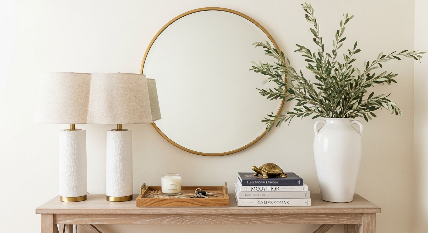
Anchor with mirror and scale-matched lamps
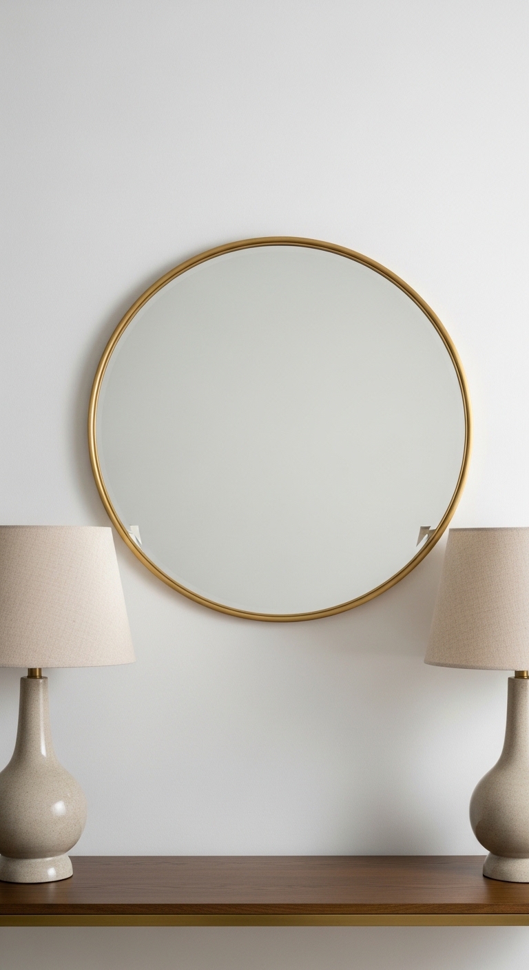
Start here. The anchor sets scale and balance. I used a 30-inch brass mirror because a mirror reflects light and visually widens a narrow hall. If your table is 48 inches, choose a mirror 2/3 the table width. That ratio keeps the mirror proportional.
Next place lamps at each end. I use a pair of linen-shade table lamps. Their combined mass defines the ends and frees the center for vignettes. Leave a 6–10 inch gap from the wall for cords and a breathing edge under tall lamp bases. A common mistake is lamps that are too small; they get lost. Match lamp height to eye level: shades should sit around 24–30 inches above the table surface for comfortable ambient light.
Layer in depth with books, trays, and sculptural accents
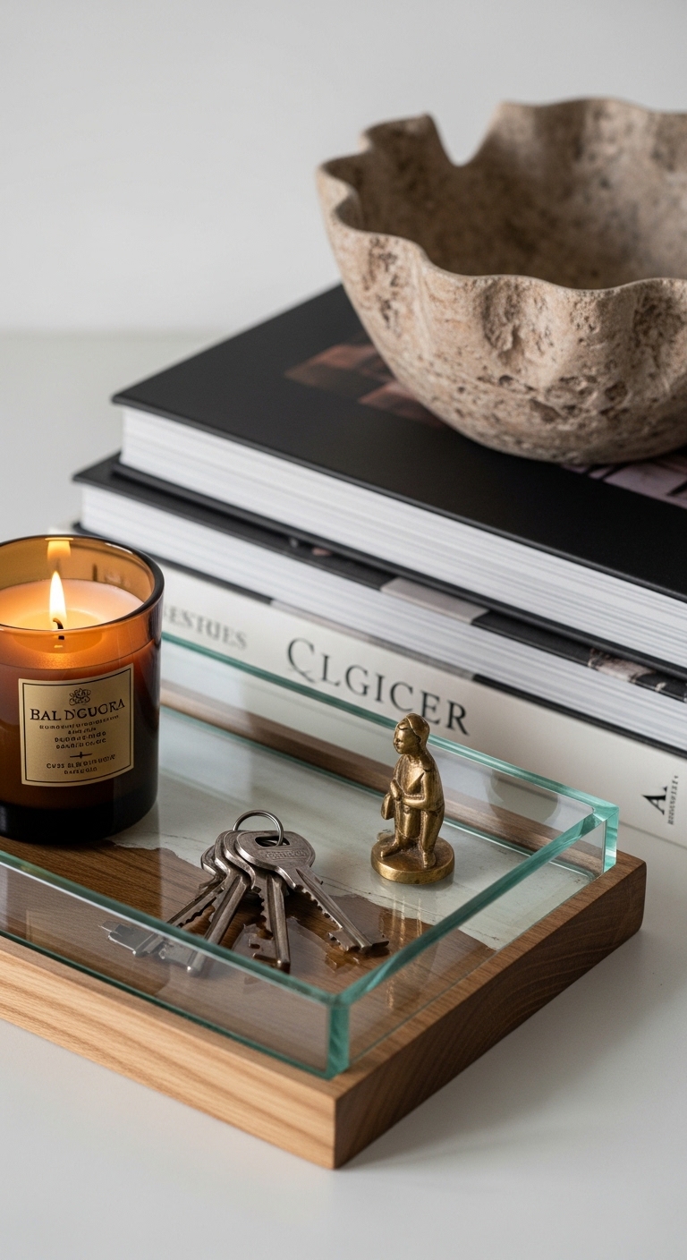
Layering builds interest without clutter. Start with a foundation stack: two large coffee table books create height and a flat surface for a small object. Across from the books place a wood and glass tray to corral daily items like keys. Trays keep things tidy and visually intentional.
Add a sculptural accent on the books. I like a small brass figurine or a ceramic bowl. Vary finishes—metal + wood + ceramic—to keep the eye moving. Use odd-number groupings: three objects often read more natural than two. The mistake I made was placing three identical vases in a row; the look was flat. Swapping one for a tray and one for a stack of books fixed that.
Add height and organic texture for warmth
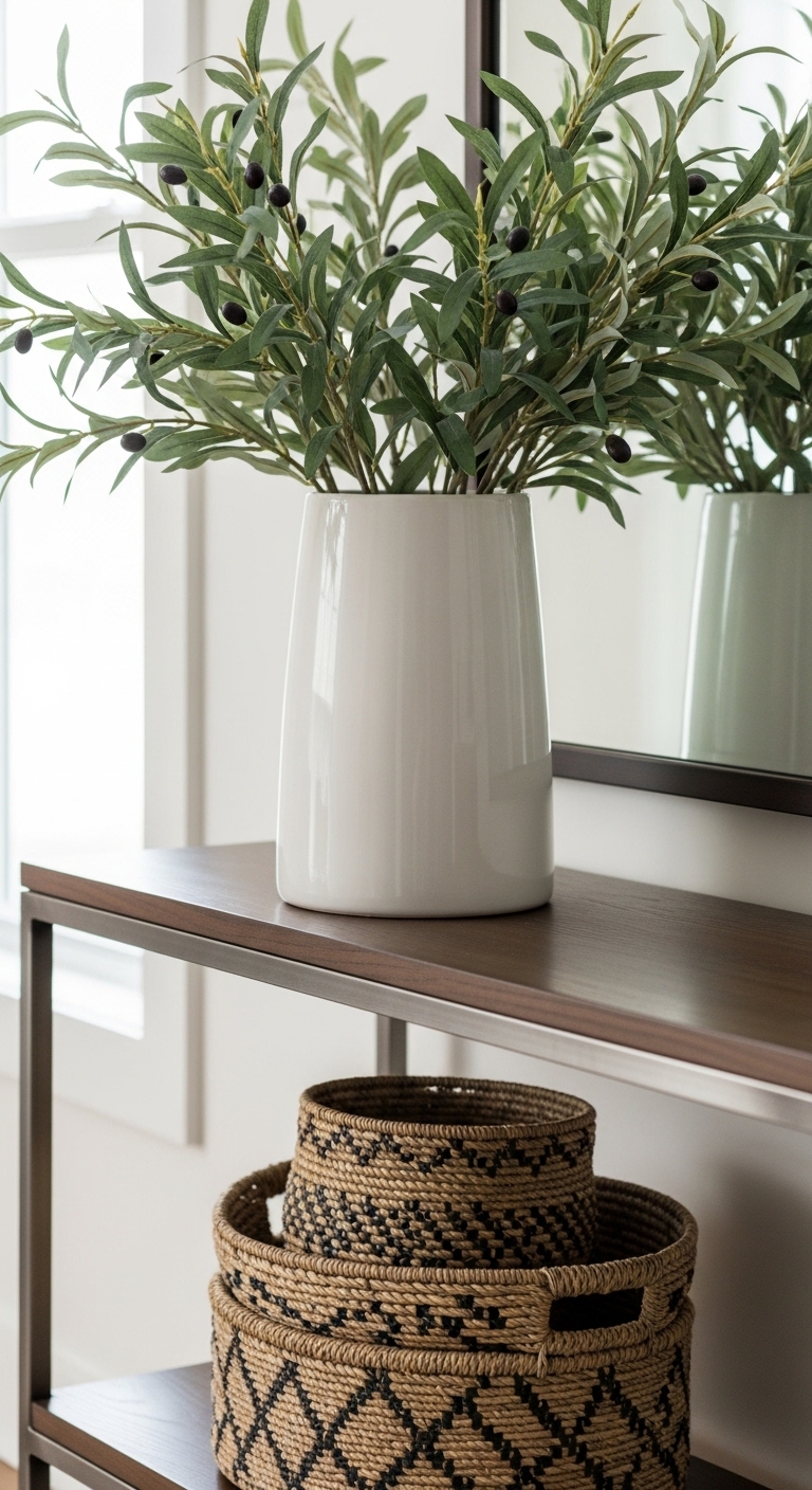
Height anchors the vertical plane and prevents the table from disappearing. A single 18-inch ceramic vase with olive branches adds organic movement. Place it opposite a lower vignette so heights cascade across the surface.
Under the table add woven baskets for shoes, mail, or scarves. They add texture and solve the practicality problem without visible clutter. Keep at least 3–4 inches of floor showing on each side for a clean footprint. The visual result is layered, lived-in, and useful.
Common Styling Mistakes to Avoid
Mistake: Using all items the same height
Why it doesn't work: The display looks flat and static.
Do this instead: Vary heights in odd-number groups. Use a stack of books plus a low tray and a tall vase.
Mistake: Crowd the center with too many small objects
Why it doesn't work: The eye can’t rest; it reads cluttered.
Do this instead: Keep the center clear or use one low tray like the wood and glass tray.
Mistake: No practical storage in high-traffic zones
Why it doesn't work: Things end up on the floor.
Do this instead: Slide in woven baskets under the table for instant order.
Shopping Guide: Where to Find These Items
- For sturdy anchors, search Amazon for white oak console tables 48-inch. A solid wood top reads current and holds weight.
- Need an instant focal point? Look for round brass mirrors 30-inch. They’re affordable and high-impact.
- For tidy vignettes, get a wood and glass tray and a 12-oz glass candle. They add scent and order.
- Short on light? Choose a pair of table lamps with linen shades rather than one oversized lamp for instant balance.
I recommend starting with the mirror and one lamp. Add the tray and one stack of books next. Small changes make the console feel finished quickly. Which piece will you add first to your console table?