How to Make a Room Look Vintage on a Budget Without Cheap Vibes

My spare-bedroom-turned-reading-room looked flat and store-bought for years. I wanted that "collected over time" vibe but without blowing the budget. I spent about $180 the first weekend (rug swap, curtains, a lamp). People now ask if my furniture is vintage. The trick was layering textures, not filling shelves.
This guide focuses on cottage-to-old-money vintage—soft neutrals, aged metals, and patterned textiles. Budget is realistic: $200–400 if you already own a sofa or bed; under $300 from scratch for a small room. Works for bedrooms, living rooms, or a cozy entry. Trending note: aged brass and layered rugs are the quickest ways to read vintage without actual antiques.
What You'll Need for This Look
Foundation pieces:
- 8×10 jute area rug in natural (~$120-180)
- Linen curtains, white, 96-inch panels (set of 2) (~$35-50 per panel; buy 2-4)
Layered rugs & toppers:
- 5×7 scalloped floral area rug topper (~$80-140)
Textiles & bedding:
- Chunky cable knit throw in oatmeal (~$40-60)
- Linen duvet cover, sage green, queen (~$70-110)
- Euro pillow inserts, 26×26, set of 2 (~$35-50)
Lighting:
- Rattan pendant light, 15-inch diameter (~$60-90)
- Table lamp with linen shade, brass finish (~$45-70)
Finishing touches:
- Artificial olive tree in cement pot, 4-5 ft (~$70-110)
- Woven storage baskets, set of 3 (~$35-55)
- Aged brass candlestick set (pair) (~$30-50)
- Vintage-style picture frames, assorted set (~$25-60)
Budget-friendly swap:
- Linen-look blend curtains (white, 96-inch) (~$18-35 per panel)

Start with the foundation: rug and curtains

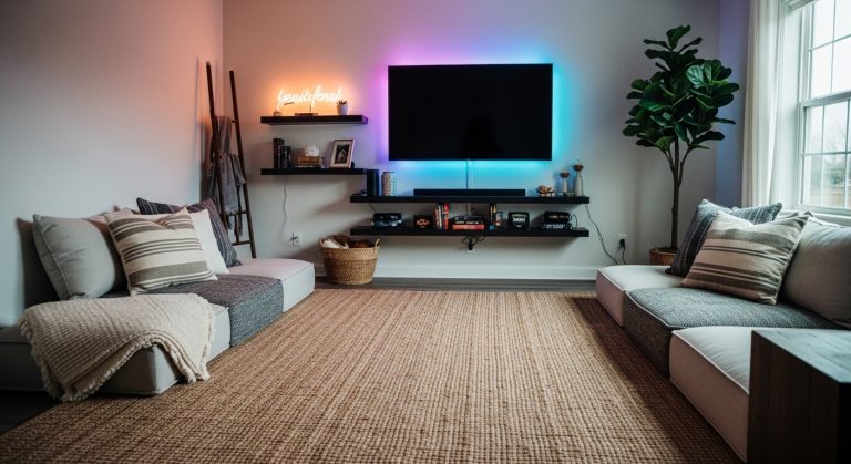
The rug and curtains set scale and mood. I used the 8×10 jute rug as a warm, neutral base. Place the rug so the front legs of your seating sit on it. For a bed, the rug should extend at least 2 feet on either side. That ratio anchors the layout.
Hang white linen 96-inch panels close to the ceiling—2–4 inches below the crown molding if you have it. This draws the eye up and makes ceilings read taller. I once hung shorter panels at the frame; the room felt chopped. Swapping to 96-inch panels fixed it immediately.
Common mistake: picking a rug that's too small. If the furniture floats off the rug, the room feels fragmented. Bigger looks intentional.
Layer in softness with oversized textiles

Add textiles in three scales: large (duvet or sofa), medium (euros and throws), small (accent pillows). I layered a linen duvet in sage green over crisp sheets, then propped two 26×26 euro inserts against the headboard. Finish with a chunky oatmeal cable throw folded at the foot.
Rule of thirds: pillows should cover roughly one-third the width of the sofa seat when grouped. Mix scale: large floral + small stripe + solid linen. I originally matched every pillow—same pattern in three sizes—and it read flat. Mixing scales brought depth.
Add patina and personality with accessories and art

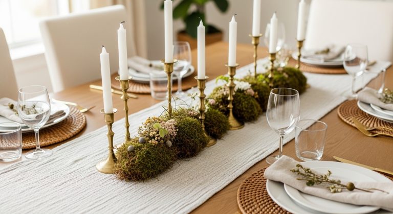
This layer sells the vintage look. I chose aged brass candlesticks and paired them with thrifted frames holding printable botanical art. For gallery walls, use odd numbers and vary frame sizes. I used three frames above the mantel (two 11×14, one 8×10). Balance is key: a taller item (candlestick or plant) on one side, a stack of books on the other.
I once bought a shiny brass lamp that read cheap. Swapping it for a lamp with a linen shade and a warmer, brushed finish made the whole vignette read older. Add one plant like the artificial olive tree, 4-5 ft for height and an organic silhouette.

Common Styling Mistakes to Avoid
Mistake: Choosing all decor at the same height
Why it doesn't work: The eye needs movement; a flat line feels staged.
Do this instead: Use varied heights in odd numbers. Try aged brass candlesticks with a taller plant beside them.
Mistake: Hanging curtains at the window frame
Why it doesn't work: It shortens ceilings visually.
Do this instead: Mount rod 2–4 inches below the ceiling. If you need a rod, use adjustable curtain rods.
Mistake: Buying furniture before the rug
Why it doesn't work: You often pick a rug that’s too small.
Do this instead: Pick the rug first. For most living rooms, aim for an 8×10 minimum.
Shopping Guide: Where to Find These Items
- For budget textiles on Amazon: search linen-look duvet covers and pillow covers to save versus real linen.
- Splurge on the rug: a hand-woven jute lasts. Look for hand-woven jute 8×10.
- If light is poor, choose realistic faux plants: I use a fiddle leaf or olive tree faux over a struggling live plant.
- Thrift first for frames and small accessories: combine thrift frames with [printable botanical art from Etsy] or printables, then slip them into a vintage-style frame set.
Start with one change: swap the rug or hang new curtains. I replaced my curtains first and the room felt taller overnight. I added the oatmeal throw three weeks later and it felt new again. What will you change first?